The Tennessee Titans have unveiled a bold new chapter in franchise history, introducing redesigned uniforms and a modernized logo that promise to energize fans across Nashville and beyond, YankeeSports reports.
A Nod to the Past, Built for the Future
The new uniforms pay homage to the Oilers’ Luv Ya Blue era while embracing nearly three decades of Titans tradition. “We wanted to come up with something that took the best parts of all of that and bring it together in a way that makes sense,” said Burke Nihill, Titans President and CEO.
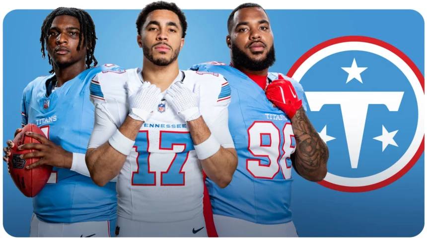
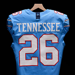
At home, Titans blue jerseys paired with white pants will dominate, while the road look features crisp white jerseys with either light blue or white pants. The word TITANS is stitched across the chest for home games, while TENNESSEE appears on away kits.
Titans Blue Takes Center Stage
The standout feature is the vibrant Titans blue, a color fans embraced through throwback Oilers sales and surveys. “Seven other teams in the NFL have navy, but this color is much more unique to us,” explained Erin Swartz, SVP of Brand Marketing. “It’s a way for fans to uniquely show their support, and really fill stadiums both home and away with Titans blue.”
Light blue jerseys showcase white numbers outlined in red, while white jerseys reverse the scheme with light blue numbers edged in red.
Logo Evolution Without the Flames
The redesigned primary logo removes the flames but retains familiarity: a bold white “T” inside Titans blue, accented with red and three white stars representing Tennessee. Helmets are now white with a distinctive six-string stripe, symbolizing Nashville’s musical heritage.
Nihill emphasized continuity: “It’s more of an evolution of the best of who we’ve always been and who we want to be going forward.”
Nashville Spirit Woven In
Every detail ties back to Tennessee. The six-string stripe runs across pants, sleeves, and helmets, while three navy stars on the neckline honor the state’s grand divisions. A woodblock font reflects Nashville’s creative roots, and inside the collar, the word WE reinforces the team’s “We Over Me” mentality.
The Titans also introduced a secondary “The Football” logo, featuring TN letters and three stars inside a football outline, further cementing their cultural connection to Nashville.
As the franchise prepares for a new stadium and a reshaped roster, these uniforms symbolize a fresh identity. Nihill summed it up: “I do hope our fans feel proud when they see it. These are the best uniforms in pro sports.”